Lesson 5: Types of Graphs
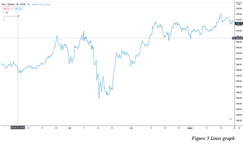
Every day, we see stock market charts on the TV news. Most often, they display line charts, but there are many other ways to visualize market data. The most commonly used types of charts in trading are:
Line Charts
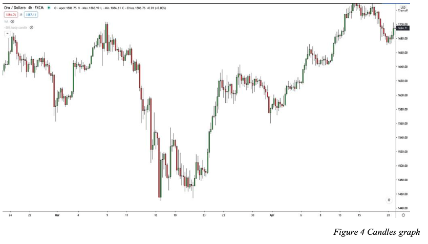
Candlestick Charts
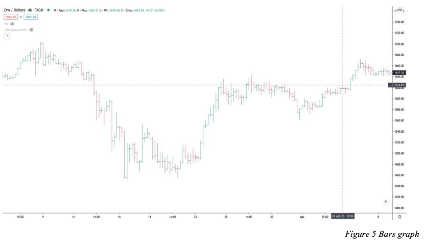
Bar Charts
Let’s explore each of them!


The Importance of Candlestick Charts
Contrary to the simple line charts shown on daily news, the candlestick chart is the primary tool for market analysis. While it may appear complex at first, understanding it is crucial for making informed trading decisions.
The Candlestick Chart Explained
As the name suggests, this chart consists of multiple candles placed next to each other. Each candle represents a specific time frame, depending on the chart settings:
1-hour chart → Each candle represents 1 hour
4-hour chart → Each candle represents 4 hours
Daily chart → Each candle represents 1 day
Understanding Candlestick Components
Each candlestick consists of:
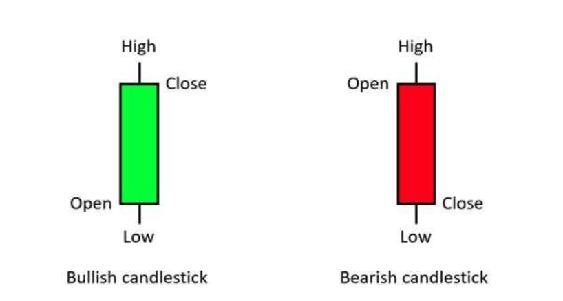
Body: Represents the range between the opening and closing price.
Shadows (Wicks): The thin lines extending from the body show the highest and lowest prices reached during that time frame.
Colors:
Green (or white) → Indicates a price increase (bullish candle)
Red (or black) → Indicates a price decrease (bearish candle)

Bullish vs. Bearish Candles
In an uptrend (Bull Market), we will see more green candles than red.
In a downtrend (Bear Market), red candles outnumber green ones.
How to Read Candlestick Formations
The opening price of a green candle is at the bottom of the body, and the closing price is at the top.
The opening price of a red candle is at the top of the body, and the closing price is at the bottom.
The upper shadow represents the highest price reached, and the lower shadow represents the lowest price touched during that period.
Start Trading
Start trading now with FintekMarkets and join thousands of traders who have already chosen this successful path.


